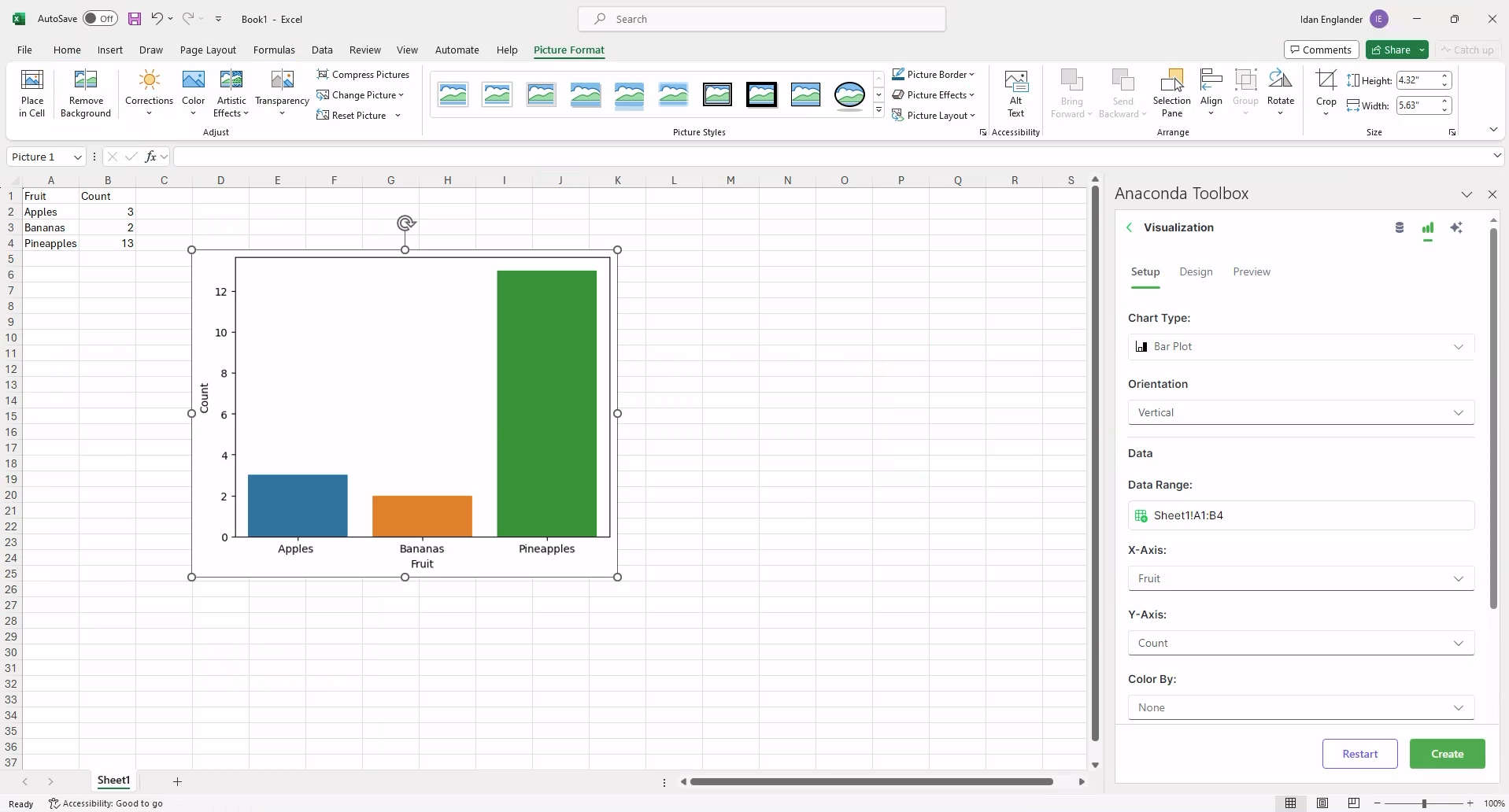
Visualize with Python#
Convert entire sheets or specific ranges into the plot best suited for visualizing your data.
Under Visualize with Python, click New Visualization.
Select a plot type to visualize the data in your sheet.
Prepare your data:
Adjust the plot settings and select your source data range from the Setup tab.
(Optional) Customize your plot further with the options provided in the Design tab.
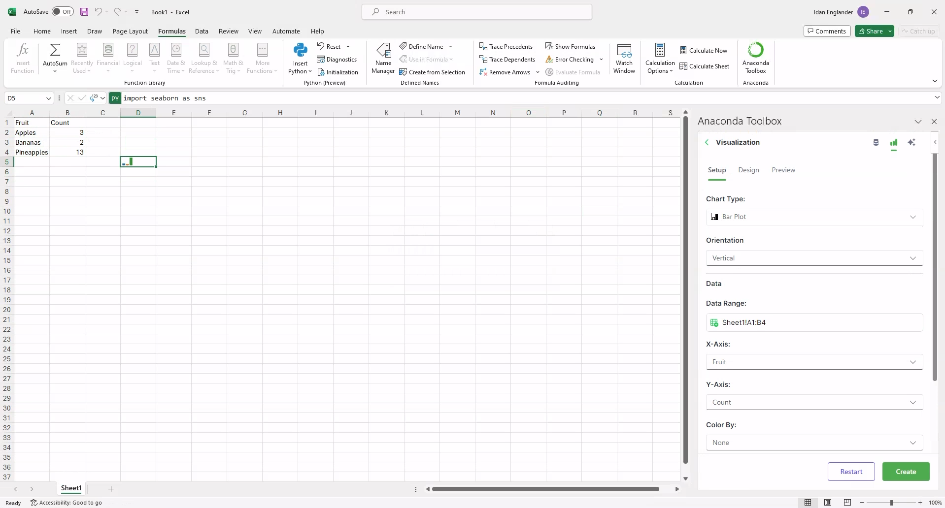
(Optional) Preview the plot and copy the visualization code directly from the Preview tab to add to other workbooks and notebooks.
From the Setup tab, set the location for the plot to render under Output.
Click Create.
The plot renders in the cell you set under Output. Right-click the plot, and in the dropdown select Picture in Cell > Place over Cells.